The Text Field is the most basic and commonly used type of form field. Use it to capture a single line of text, or multiple lines if desired.

Drag and Drop, or double-click, to add Text fields to your drafted form.

2. Next, set various properties in the right side pane to define behaviors and style for the text on the form.
Basic Properties
Data Name
This is the name of the field that should be referenced in any form of logic or API calls. Users will not see this name on the form.

Data names cannot contain spaces or special characters other than an underscore and must begin with a letter. They are case-sensitive and must be referred to precisely whenever they are referenced.
Title Text
This is the name of the field that will be displayed to users on the app. This property is completely optional; while a field must contain a data name, a field title is optional.

The text color may be chosen with a hex code. The text may be also formatted as Bold or Italic and given a relative size -- Small, Medium (the default), or Large.
Hint Text
This optional field can be used to show secondary information to the user in the app. Consider using this to provide instruction or clarification to the user as they fill out the field.

Formatting options for this property are the same as those given available for the Title Text property.
Layout & Styling
Field Layout
This drop-down determines how this field is shown on the screen.

- Vertical places the Title and Hint vertically above the entry field.

- Horizontal will stack the entry field to the right of the Title and Hint text.

- Horizontal (Tablets Only) will use Vertical layout for phones and Horizontal for tablets.
Background Color
The color chosen in the hex code field here will apply to the field. The Transparent box can also be chosen instead for making this transparent instead of a solid color.

Text Lines
This property determines the number of lines of text that the field shows to the user on the app. Adding more than one line will make the field larger, allowing the user to see more of their entry.

Placeholder Text
Text entered into this property defines the hint text shown inside the field's answer box. If this is left blank, then defaults to "Enter text..."

Validation & Behavior
Required
Checking this box will enforce validation against this field to make the field required, disallowing the user from progressing to the next page or submitting the form if it is left blank. If the user tries, they will be prompted with an error to return to the field and enter a value. When this validation occurs is determined by the "Validation Property" chosen on the page level; please see this article for more details on this.

This property can also be made conditional based on a formula. To enable this, click "add condition" below the checkbox and enter a formula into the field that populates. The formula serves as the basis of the requirements of this field.

Please see this article for more information on conditionally-required fields.
Visibility
The contents of this field will determine whether the field will be visible to the user. For more details on visibility rules, please see this article.

Dynamic Value
This property is used to define a calculation/formula that will populate the field's value. Often this is used in conjunction with the "Read Only" property (see below) so that the field will calculate and display to the user without the possibility of manual edits. This article is recommended as a starting point for more reading on this.

Please see this article for details on the relationship between Default Value and Dynamic Value.
Read Only
If this checkbox is checked, users will be able to see the contents of the field but will be unable to make edits.

Similar to the Required property, the Read Only property also includes the ability to define a conditional formula determining whether the read-only property is enabled. Click "add condition" to define such a formula.

Custom Validation
Add your own custom formula to this property for validating text entered into this field by users. The formula is only applied when the field has an answer. Enforcement will be done according to the "Validation Property" chosen on the page level; please see this article for more details on this.

Validation Message
The contents of this property will serve as a custom message to display to the user if their input fails validation.

Answer Format
The value chosen in the drop-down will enforce validation upon user entry as described below.

Email Address - input must be in the format of a single email address. For multiple email addresses, please consider a RegEx formula in the Custom Validation property. See this article for more details.
- Local Phone - input must be in the format of a local phone number.
- International Phone - input must be in the format of an international phone number.
- Web Address - input must be in the format of a web address.
Restrict Length
Checking this box enforces validation against string length as specified in the two fields below the checkbox. The length of the user input must be within the range of the numeric values specified if length restriction is enabled.

Disable Predictive Spelling
By default, any text entered into this field will run through the native device's predictive text and spell checker to assist with correct input. For cases where a code or other non-word-based text needs to be entered, checking this box will turn off the predictive options. giving the user a faster and less intrusive text entry experience.
Advanced Options
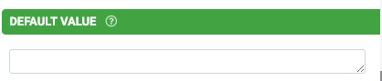
Default Value
The value entered in this property serves as the initial value of the field prior to manual input. Please see this article for details on the relationship between Default Value and Dynamic Value.
Bind to Data Source Column
This property allows for the binding of the contents of the field to a data source that is linked to either a choices field or a data field on the form.

- The data source can be selected with this dropdown. More than one will be available if multiple data source control fields (choices fields or data fields) have been added to the form.
- The data source control field can be selected from this dropdown. More than one will be available if multiple data source control fields for the same data source have been added to the form.
- The column on the data source to be bound can be selected from this dropdown.
Data Source binding allows you to create forms that can load data from, and update data to, any given data source. This opens up amazing opportunities to have dynamic data that is updated on the move (e.g., adding contacts or clients). For more information, please see this article.
Bind to Global Value
 Global Values are a local key/value store that is available on any Screen on the app. Use this property to allow the user to view and save defaults for use across the app (e.g., a default project or customer). Please see this article for more information.
Exclude from Export/Display
By default, every field is displayed on Form entries in the Data area and is included in non-templated exports (e.g., generic pdf, CSV, spreadsheet, database connectors). Use this property to prevent this field from showing on all such displays and exports.

Is Personal Data
Indicates that data captured in this field may contain personal or sensitive data, which in turn can be anonymized when exported from the platform when then the "Anonymize Personal Data" option is checked on a form connector. Please see this article for more on this.
NOTE: Use of this option does not grant or imply additional security, protection, and privacy of data.
